Color Chrome Effect and Color Chrome FX Blue Explained: Only One Needs a Second Thought
Chrome color FX is really two settings in your Fujifilm camera's menu: Color Chrome Effect and Color Chrome FX Blue. Each has just three positions: Off, Weak and Strong. My view is that they don't deserve the same amount of thought. Color Chrome FX Blue should be chosen for the kind of sky you shoot under. Color Chrome Effect mostly follows the film simulation and the Color setting, and once it's set, you can leave it alone.
Sorting out the names comes first, because that's where most copying mistakes start. FX Blue shows up in recipe lists as Color Chrome Blue, Color Chrome Effect Blue, ChromeFX, Chrome FX, or just FX Blue. Then there's Classic Chrome, a film simulation with an almost identical name. Put three "Chromes" in one settings table and it's easy to drop a row, or to read one as another.
This guide covers four things: which part of the picture each setting changes, where the camera and the JPEG keep them, how recipes in our community combine them, and when to turn one down. It doesn't cover the Classic Chrome film simulation itself, or whether an older recipe's FX Blue should change on a newer body; that question belongs to our guide to fourth- and fifth-generation recipes. Distribution figures come from recipes in the FujiStyle community.
In a hurry? The short version
- Menu names: both sit in the IMAGE QUALITY SETTING menu, as COLOR CHROME EFFECT and COLOR CHROME FX BLUE. Color, the saturation setting, is a separate item; don't confuse it with Color Chrome Effect.
- Positions: Off, Weak and Strong. Nothing else.
- If you don't want to think about it: Color Chrome Effect on Strong. FX Blue on Strong for an ordinary sunny day, Weak when the sky is already deep (midday, high altitude, a polarizer), Off if you want a soft, airy look.
- Does your camera have them? Bodies such as the X-T5, X100VI, X-T50 and X-S20 have both. The X-T3 and the original X-T30 have Color Chrome Effect but not FX Blue; the X-T2, X-Pro2, X-H1 and other bodies of that generation have neither. The full list is near the end.
- The most common copying mistake: leaving out the FX Blue row, or reading "Color Chrome" as the Classic Chrome film simulation.
It's easy to treat both settings as a stronger saturation dial: if a recipe says Strong, you turn them on. Go through community cards, though, and you'll find two recipes that look nothing alike using the same pair of settings. One is a red car parked on a sunny street, with the paint at full strength; the other is a snowy river gorge in pale blue and white. Both have Color Chrome Effect and FX Blue on Strong. Same two Strongs, one photo dense and one pale. Whatever decides how rich a photo looks, it isn't these two.
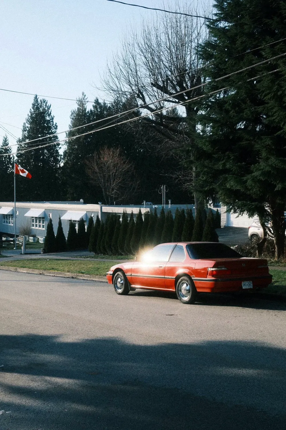 Euljiro Negative by clockwise_yvr.
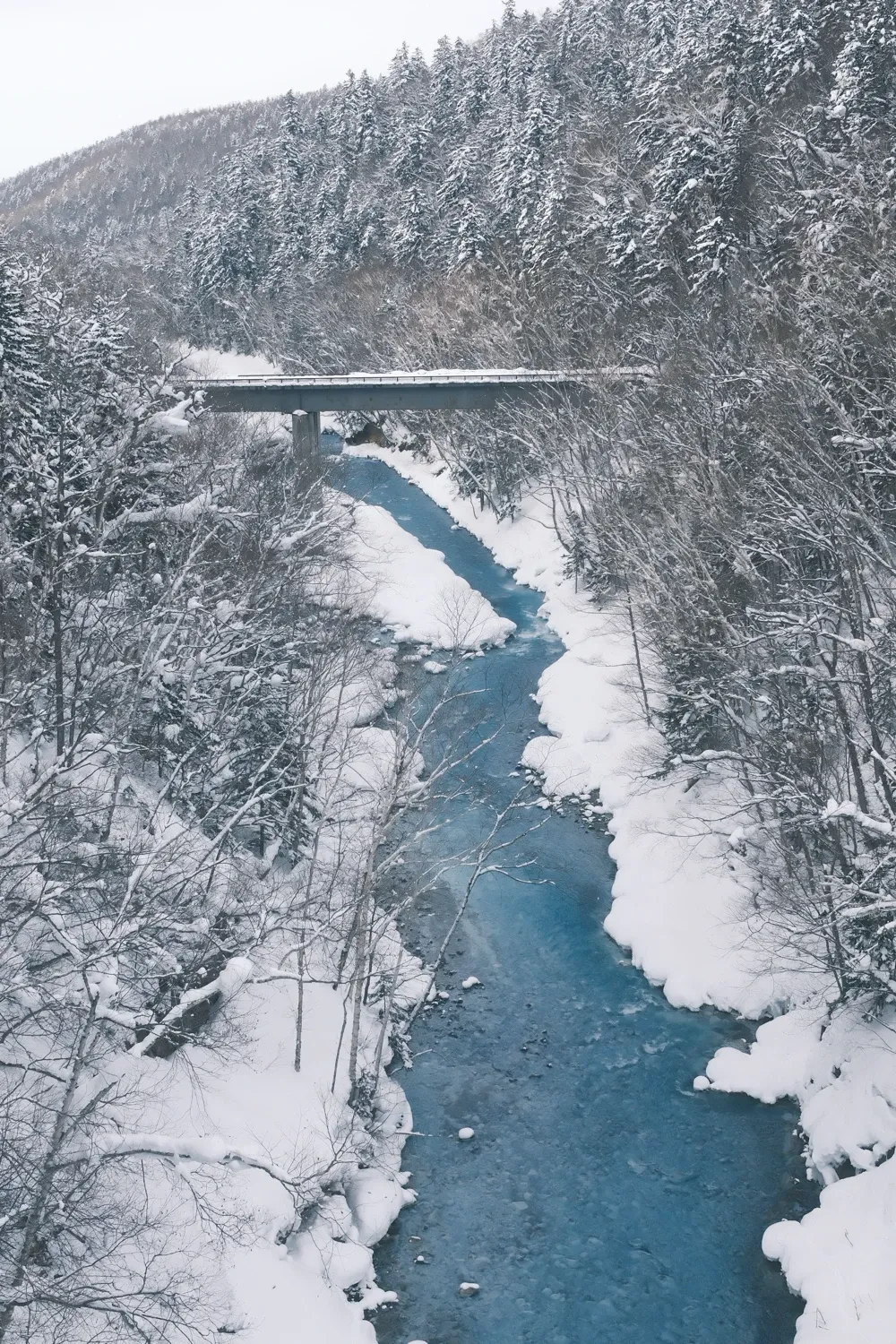 Classic Blue, shared on FujiStyle by Shareal_willie.
Classic Chrome vs. Color Chrome: three "Chromes," three different things
Color Chrome Effect is an in-camera Fujifilm color setting with three positions (Off, Weak and Strong) that works on colors which saturate easily, such as reds, yellows and greens, giving them more depth in their darker tones; it is not a film simulation, and it doesn't change the overall color of the photo.
Color Chrome FX Blue is a separate setting with the same three positions that works only on blue areas, making skies and seas deeper and more layered; it is not the same thing as shifting white balance toward blue.
Classic Chrome, by contrast, is a film simulation. It sets the character of the entire JPEG: low saturation, firmer contrast, subdued reds. It has a page of its own: the Classic Chrome film simulation.
| Color Chrome Effect | Color Chrome FX Blue | Classic Chrome | |
|---|---|---|---|
| What it is | Color effect | Color effect | Film simulation |
| Works on | Colors that saturate easily: reds, yellows, greens | Blues | Color and contrast of the whole JPEG |
| Positions | Off / Weak / Strong | Off / Weak / Strong | No levels; it's selected or it isn't |
| Changes the overall color? | No | No | Yes |
| Can it stand in for the others? | No | No | No |
The three stack. Classic Chrome as the film simulation, with both effects switched on, is a common combination in our community.
The idea that these settings "add depth to saturated colors" comes from Fujifilm's own manuals; it isn't my discovery. What I want to add is two things: how the camera stores them, and what community data says about how people actually set them.
Inside the camera: two three-position switches that travel with the custom slot
In the settings table FujiStyle writes to the camera, these two are the simplest rows. Each is a standalone value with three positions: Off, Weak and Strong. There's no numeric scale and no "Strong+." So when a recipe online says "Color Chrome +1" or "FX Blue 2," that's the author's own shorthand, and you'll need to translate it into one of the three before you set your camera.
A few things that matter when you're the one shooting:
- They're stored in the custom slot with everything else. Whether you set a recipe by hand and save it to C3 or write it to C3 from your phone, these two values go into C3 along with the rest, replacing what that slot held. Nothing changes in photos you've already taken, and RAF files aren't touched. If you haven't loaded a slot before, here's how to add a recipe to your camera.
- They're recorded in the JPEG. A JPEG made in the camera stores which position each one was on in its maker notes. That's what makes a missing row recoverable, which I'll come back to.
- Not every body has them. Some older cameras have neither in the menu; the camera list near the end shows which is which.
- On a body that lacks these two rows, check the slot after writing. After writing a recipe, look at the slot itself, either in the camera's EDIT/SAVE CUSTOM SETTING menu or, faster, by tapping Camera Recipes in FujiStyle, which shows what each C slot on the camera holds right now. Trust that over the recipe card.
Two Chromes, Color and a blue WB Shift: what each one touches
A lot of "I copied the settings and it doesn't look the same" comes from treating these four settings as one. The table below is a reading based on Fujifilm's descriptions and the community photos in this guide. For your own camera and light, a quick side-by-side of your own is the surest check (how to do one is further down).
| In the frame | Color Chrome Effect Strong | FX Blue Strong | WB Shift toward B | Higher Color |
|---|---|---|---|---|
| Red signs, orange leaves, yellow cars (already saturated) | Darker tones deepen; more gradation | Mostly unchanged | Turn cooler with everything else | More vivid; push too far and they become flat blocks |
| Blue sky, deep sea | Mostly unchanged | Deeper, denser | Bluer, but whites turn blue too | More vivid |
| White walls, white clothes | Unchanged | Unchanged | Turn blue | Mostly unchanged |
| Skin | Mostly unchanged | Unchanged | Goes cold and bluish | Redder, more vivid |
| Gray skies, flat overcast light | Barely visible | Barely visible (no blue to deepen) | Whole frame goes cool | A little |
Two things follow from that table. If you want the whole picture richer, the setting to move is Color. If you want a bluer sky with the people left as they are, it's FX Blue. Neither Chrome setting is in charge of how rich the whole photo looks.
Color Chrome Effect: keeping depth in strong colors
To see what it does, you need a scene where color is already at full strength: a red streetcar in midday sun, orange autumn leaves, a yellow taxi. The usual trouble with colors like these in a JPEG isn't that they're too weak. It's that once they're very saturated they stop having any shape, and the side of the car facing the light and the side in shade turn into one block of red. Color Chrome Effect deepens the darker side of those saturated areas a little, and the red gets its volume back.
That's why it often makes a picture look deeper, not brighter or more vivid. If a recipe looks dull to you, check its Color value before you switch Color Chrome Effect off.
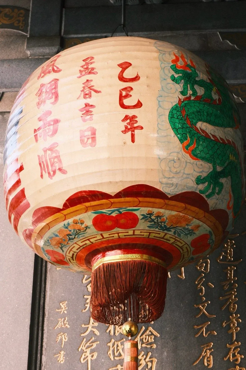 Pagoda, shared on FujiStyle by milcah_h.
This lantern is about as saturated as a subject gets: red paper, gold characters, a green dragon. Pagoda uses Classic Neg. with Color +2 and Color Chrome Effect on Strong. What I'd credit to Color Chrome Effect is the curve of the lantern: the red darkens gradually toward the edges instead of flattening into one block of paint, so it still reads as round. That's my reading, though. A single photo has no Off version to compare against, so the two settings can't be cleanly separated.
Now look at the snowy gorge from the start. Classic Blue also has Color Chrome Effect and FX Blue on Strong, but its Color is 0, and Highlight and Shadow are both at -2, which keeps the tones soft. The snow is white and the water a pale gray-blue. Put it next to the red car and the pattern is clear: how rich a photo looks comes mostly from Color, exposure and light, and the two Chrome effects only do anything where color is already dense. The water in the gorge isn't saturated enough to give FX Blue much to work with.
There are times not to max it out. A film simulation that's already vivid gets even denser on Strong. Shoot red flowers on Velvia and Strong can push the shadows inside the petals toward black; Weak or Off looks cleaner. Some recipe authors make that choice up front:
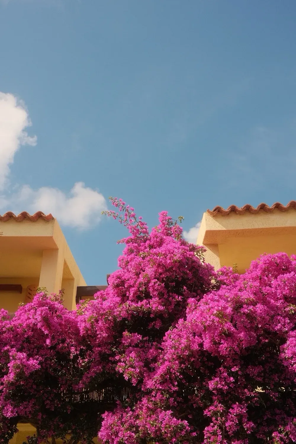 Italian Summer by Emanuele De Luca.
Emanuele De Luca's Italian Summer runs Classic Chrome at Color +4, the top of the scale, but keeps both Chrome effects on Weak. The bougainvillea is as bright as a JPEG gets, and the flowers still separate from each other instead of merging into one patch of magenta. Red autumn leaves are the other classic case, and our post on fall recipes has more examples: when leaves turn into blobs of color, the usual cause is Color set too high, and Color Chrome Effect is the setting that helps hold detail there.
Color Chrome FX Blue: the one that only handles blue
FX Blue (also written as Color Chrome Blue or Color Chrome Effect Blue) works on the same principle as Color Chrome Effect, but only on blue. Sunny skies, deep water, blue walls: with it on, they get deeper and denser, and the difference between the blue near the horizon and the blue overhead becomes more pronounced.
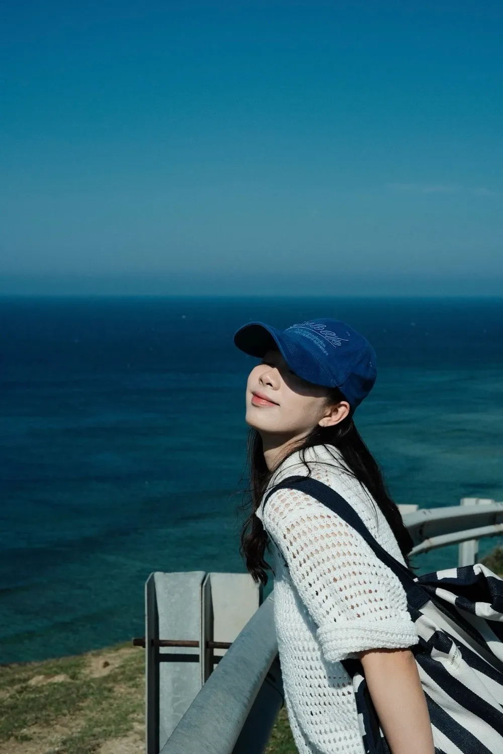 Summer Blue, shared on FujiStyle by Haihalu.
Summer Blue, shared by Haihalu, is built on Classic Chrome with both effects on Strong, Daylight white balance, and a WB Shift of R0 / B0. That last part is the interesting one. The card doesn't push white balance toward blue at all, so the deep blue of the sea and sky comes mostly from FX Blue and Classic Chrome, while her white top and her skin stay neutral.
This is the most common misunderstanding: FX Blue is not a blue white balance shift. Pushing WB Shift toward B cools the entire picture, so white walls turn blue and skin goes cold. FX Blue touches only the blue areas, and whites stay white. If you do want the whole frame cooler, that's a job for white balance shift.
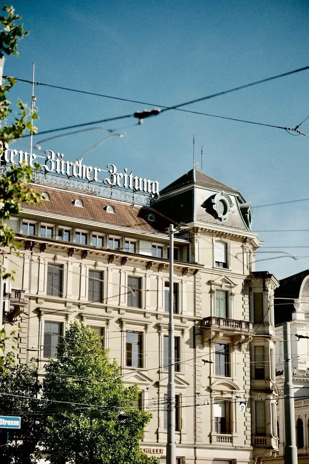 Chrome Zürich, shared on FujiStyle by Parti.
Chrome Zürich has a WB Shift of R+3 / B-5 on Auto (White Priority), which moves the whole picture a good way toward warm yellow, yet the sky above the building is still a saturated deep blue. The card has Color +3 and FX Blue on Strong. Warm white balance, and a blue sky that didn't go gray: overall color temperature and how deep the blue gets are two separate axes, and you can set them separately. Classic Chrome and Color +3 are doing some of the work here too, so not all of it belongs to FX Blue.
FX Blue on Strong goes wrong mainly when the sky is already deep. At midday, at altitude, or with a polarizing filter on the lens, Strong can push the sky toward navy. A dark statue in silhouette can handle that; a pale facade like this one, in front of a sky like that, can start to look pasted on. Other sunny-day trade-offs are in our guide to sunny-day recipes.
"Chrome color FX" is really two decisions: how the community sets them
Start with the big sample. Across recipes in the FujiStyle community, the two settings are distributed very differently:
| Position | Color Chrome Effect | Color Chrome FX Blue |
|---|---|---|
| Off | 28.9% | 35.8% |
| Weak | 6.9% | 25.8% |
| Strong | 50.6% | 24.8% |
| Not filled in | 13.6% | 13.6% |
Color Chrome Effect has essentially two answers, all the way on or off, with Weak at under one in ten. FX Blue splits almost evenly three ways. My reading is that people treat Color Chrome Effect as a switch and FX Blue as a dial, because FX Blue directly decides what the sky looks like, and the sky is often a big part of the frame. That's a guess; the numbers can't show why anyone chose what they did. But it's where the argument of this guide comes from.
Now the nine recipes used in this guide, all community cards with FX Blue switched on. Only the columns that matter here are shown.
| Recipe | Author or sharer | Film simulation | Color | Color Chrome Effect | Color Chrome FX Blue |
|---|---|---|---|---|---|
| Euljiro Negative | clockwise_yvr (author) | Classic Neg. | +3 | Strong | Strong |
| Classic Blue | Shareal_willie | Classic Neg. | 0 | Strong | Strong |
| Pagoda | milcah_h | Classic Neg. | +2 | Strong | Weak |
| Italian Summer | Emanuele De Luca (author) | Classic Chrome | +4 | Weak | Weak |
| Summer Blue | Haihalu | Classic Chrome | +2 | Strong | Strong |
| Chrome Zürich | Parti | Classic Chrome | +3 | Strong | Strong |
| Summer Hi | ap.vzn | Pro Neg. Hi | +3 | Strong | Strong |
| Clockwise Negative | clockwise_yvr (author) | Classic Neg. | +4 | Strong | Weak |
| Cyclades Paradise | Gavelin | Pro Neg. Hi | +1 | Weak | Weak |
Seven of the nine have Color Chrome Effect on Strong; FX Blue is Strong on five and Weak on four. Because they all have FX Blue on, there's no Off in the group, so read it as a set of examples, not as a distribution. Below is one recipe for each of the three combinations, with settings exactly as they appear on the card.
Strong / Strong: deep blue sky and strong warm color
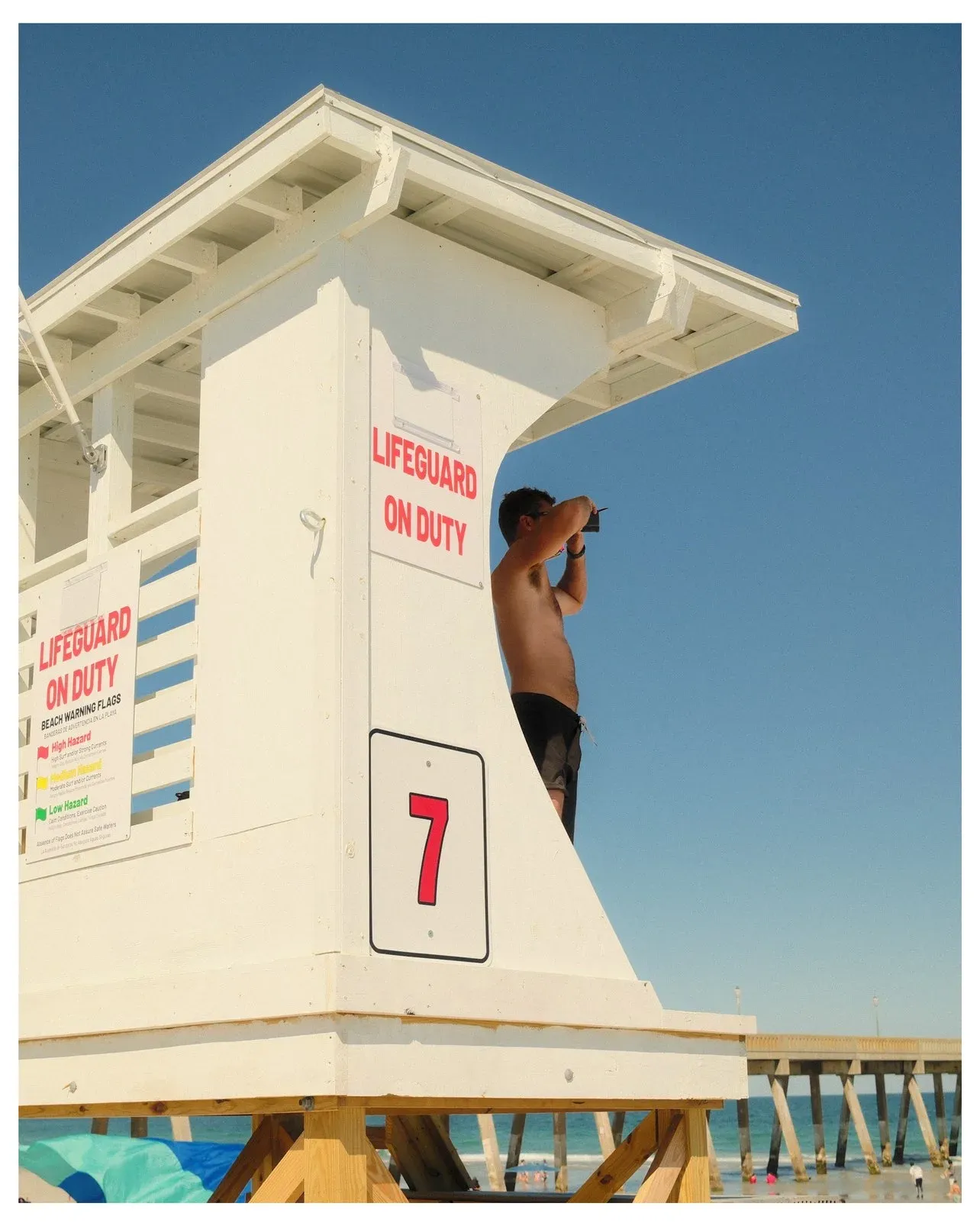 Summer Hi, shared on FujiStyle by ap.vzn.
In ap.vzn's sample for Summer Hi, the red lettering on the lifeguard tower, the white walls and the deep blue sky are all at full strength. Both effects on Strong suit a beach at midday in full sun. It's the wrong pick for an overcast day: there's no blue up there to deepen, so FX Blue might as well be off, and what's left, Color +3 and the warmth of 6300K, looks forced under a gray sky.
| Setting | Value |
|---|---|
| Film Simulation | Pro Neg. Hi |
| White Balance | 6300K |
| WB Shift | R+1 / B+3 |
| Dynamic Range | DR400 |
| Highlight | -2 |
| Shadow | +1.5 |
| Color | +3 |
| Sharpness | 0 |
| High ISO NR | -4 |
| Clarity | 0 |
| Grain Effect | Strong / Small |
| Color Chrome Effect | Strong |
| Color Chrome FX Blue | Strong |
| Exposure Compensation | 0 |
| ISO | — |
Strong / Weak: warm color first, sky held back
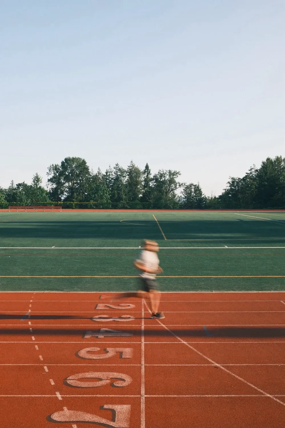 Clockwise Negative by clockwise_yvr.
In clockwise_yvr's sample for Clockwise Negative, the red running track and the green field are the subject; the sky is a pale strip above the tree line. In a composition like that, FX Blue on Weak makes sense, because the sky isn't competing for attention, while Color +4 and Color Chrome Effect on Strong keep the red track dense. It's a poor fit for landscapes with a lot of sky: Weak blue looks light in a wide-open scene, and it doesn't sit well with the dense warmth of Classic Neg. at Color +4.
| Setting | Value |
|---|---|
| Film Simulation | Classic Neg. |
| White Balance | Auto |
| WB Shift | R+1 / B-3 |
| Dynamic Range | DR400 |
| Highlight | -1 |
| Shadow | -1.5 |
| Color | +4 |
| Sharpness | -2 |
| High ISO NR | -4 |
| Clarity | 0 |
| Grain Effect | Strong / Large |
| Color Chrome Effect | Strong |
| Color Chrome FX Blue | Weak |
| Exposure Compensation | — |
| ISO | — |
Weak / Weak: the restrained approach
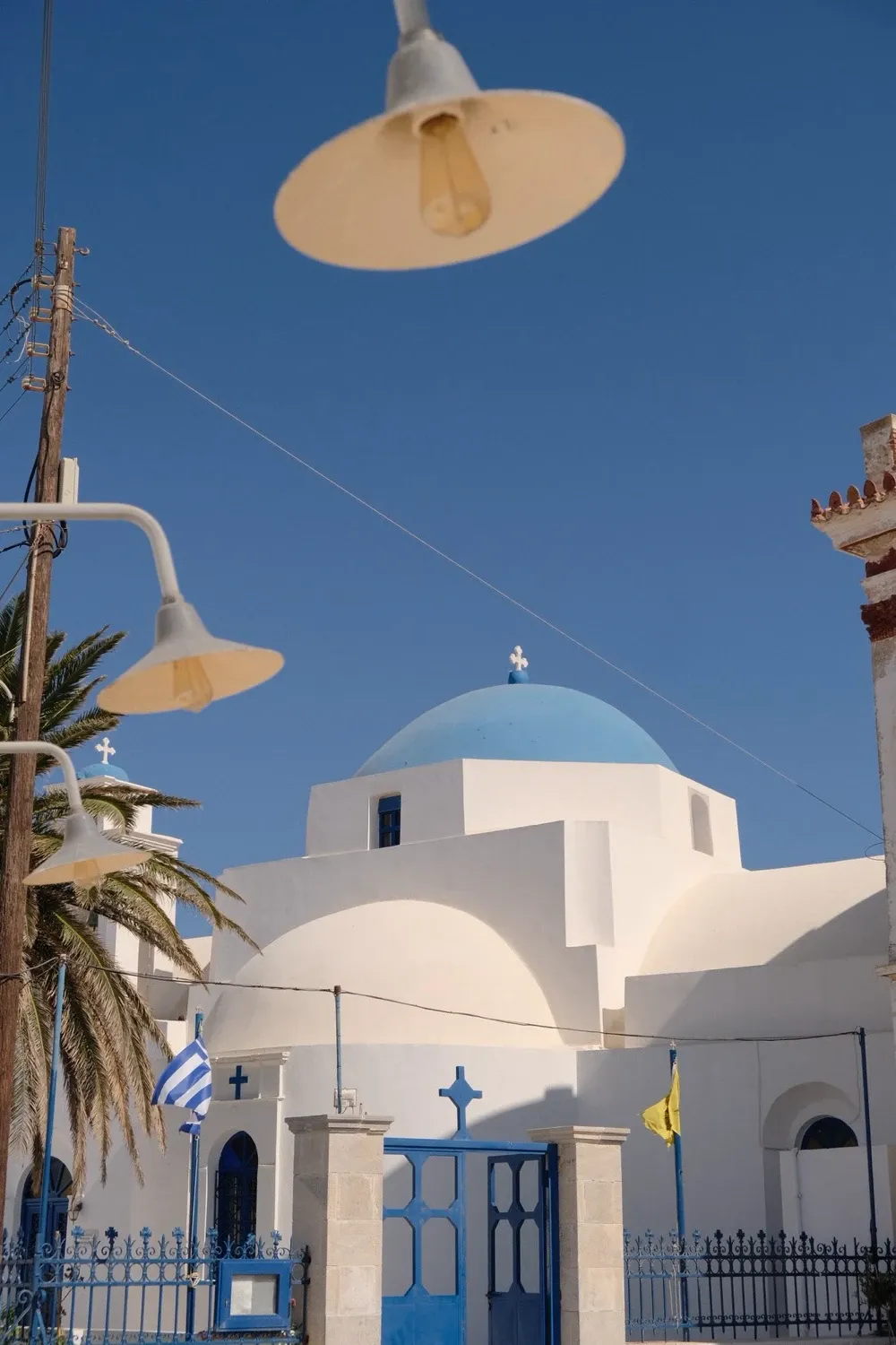 Cyclades Paradise, shared on FujiStyle by Gavelin.
Cyclades Paradise, shared by Gavelin, has both effects on Weak and Color at only +1, and Italian Summer above shows that Weak / Weak can still mean loud color when Color is at +4. Here it stays restrained. On a white chapel with a blue dome, the dome and the sky are clearly blue but don't overpower the white walls, which stay clean. Its weakness is at the other end: if you want a glowing, deep Aegean blue, this one will feel a step short.
| Setting | Value |
|---|---|
| Film Simulation | Pro Neg. Hi |
| White Balance | 6000K |
| WB Shift | R+1 / B+3 |
| Dynamic Range | Auto |
| Highlight | -1.5 |
| Shadow | -2 |
| Color | +1 |
| Sharpness | -1 |
| High ISO NR | -3 |
| Clarity | 0 |
| Grain Effect | Weak / Small |
| Color Chrome Effect | Weak |
| Color Chrome FX Blue | Weak |
| Exposure Compensation | 0 |
| ISO | — |
Weak or Strong: decide FX Blue first, then Color Chrome Effect
Look at the sky first, then at the film simulation. Written out as rules:
FX Blue (look at the sky)
- The sky fills more than half the frame and is already deep (midday, high altitude, a polarizer, a dry, clear winter day) → Weak.
- An ordinary sunny day, with the sky as a supporting element or under half the frame → Strong is fine.
- Overcast, gray sky, indoors → the position makes little difference; keep the recipe's value.
- You want a faded, airy look → Off, which keeps the decision simple.
Color Chrome Effect (look at the film simulation and Color)
- The film simulation is already vivid (Velvia), or Color is already at +3 or +4, and the subject is a saturated red flower or yellow car → Weak or Off.
- Everything else → Strong as your default, and you can stop thinking about it.
The other side: why not just put both on Strong?
That's a fair position, and I'll grant it first. Both effects work only on particular colors, and in most scenes the cost of Strong is small: gray skies, interiors and photos built around skin tones barely involve them. Half the recipes in our community max out Color Chrome Effect, and they aren't doing it blindly.
A small cost isn't no cost, though. Three situations cause trouble:
- The color is already full. Velvia, Color +4, red flowers and yellow cars at noon: Strong drags the shadows down, and dark patches appear inside the saturated areas.
- The sky is already deep. High altitude, a polarizer, a clear winter day with low humidity: FX Blue on Strong makes the sky so heavy it comes loose from the ground.
- You want pale. In faded, airy pictures, the two effects won't ruin the look, but they won't help it either.
Of the first two, you'll run into the second far more often, because nearly every outdoor photo has sky in it and far fewer have red flowers or yellow cars. That's why FX Blue comes first.
What happens if you leave out FX Blue
A lot of recipe lists that circulate online stop at Color Chrome Effect and skip FX Blue. Others read "Color Chrome" as Classic Chrome and swap out the whole film simulation. The second mistake is a big one. The first is smaller than it sounds: the photo isn't ruined, and the difference shows up mostly in sky and water, which will come out a step lighter or a step deeper than the sample.
It's one reason a copied recipe doesn't look like its sample photos, but only one. Light and exposure usually matter more, as covered separately in why online Fujifilm recipes never turn out the same. And as mentioned above, the FX Blue position is recorded in the original JPEG's shooting data, so if you have the photographer's original file, FujiStyle's Import from Photo reads it for you instead of leaving you to guess.
The table of what each setting touches is a reading. To see the three positions for yourself, all you need is a RAF: load a RAF with some sky in it into FujiStyle's Raw Darkroom, change only FX Blue, and let the camera's own engine render each position. Same moment, same light, one setting apart.
Which Fujifilm cameras have Color Chrome Effect and Color Chrome FX Blue
This list follows the IMAGE QUALITY SETTING pages of Fujifilm's online owner's manuals. If your camera's own menu shows something different, trust the menu.
| Camera | Color Chrome Effect | Color Chrome FX Blue |
|---|---|---|
| X-T5, X-T50, X100VI, X-H2, X-H2S, X-S20, X-E5, X-M5, X-T30 III, X-T4, X-Pro3, X100V, X-S10, X-E4, X-T30 II | Yes | Yes |
| X-T3, X-T30 (original) | Yes | No |
| X-H1, X-T2, X-T20, X-Pro2, X-E3, X100F | No | No |
| Older bodies such as the X-T10, X-E2S and X100T | No | No |
| GFX100, GFX100S, GFX100S II, GFX100 II, GFX50S II, GFX100RF | Yes | Yes |
| GFX 50S, GFX 50R | Yes | No |
For any camera not listed here, check your camera's IMAGE QUALITY menu.
A recipe can't produce a setting your camera doesn't have. If you shoot a Strong / Strong recipe on a body without FX Blue and the sky doesn't match the sample, that's expected; you didn't set anything wrong. For the other settings and film simulations that differ between camera generations, see our guide to fourth- and fifth-generation recipes.
Back to where we started
At the top I said these two settings don't deserve equal thought. After the numbers and the examples, I'd put it more precisely. Color Chrome Effect really isn't a saturation dial, and precisely because it handles depth rather than richness, whether it's on rarely decides how a photo looks overall. That's why most people in our community simply max it out, and most of the time that's fine. Of the two Chromes, the one that actually changes the picture is FX Blue: the sky takes up so much of the frame that when FX Blue moves, you see it at first glance.
Next time you copy a recipe, make sure the FX Blue row came across correctly, then look at the sky you're about to shoot and decide whether it needs a step down.
Frequently asked questions
What is Color Chrome FX Blue?
Color Chrome FX Blue is an in-camera color setting found on many, but not all, Fujifilm cameras; it has only three positions (Off, Weak and Strong) and deepens the blue areas of a photo, such as sky and sea. It is not a film simulation, and it is not a white balance shift toward blue: white walls and skin stay largely as they were, while pushing WB Shift toward B cools the whole picture.
What's the difference between Color Chrome Effect and Color Chrome FX Blue?
Neither one controls how rich the whole photo looks; each works only on certain colors. Color Chrome Effect adds depth to colors that saturate easily, such as reds, yellows and greens, and FX Blue does the same for blues only, so one can't stand in for the other. Color Chrome Effect on Strong usually makes a picture look deeper rather than more vivid; for more color overall, adjust the Color setting.
Is Color Chrome the same as Classic Chrome?
No. Classic Chrome is a film simulation that sets the color character of the whole JPEG; Color Chrome Effect and Color Chrome FX Blue are effects that sit on top of whichever film simulation you choose and act only on certain colors. You can use all three together, but none of them replaces another.
Which Fujifilm cameras have Color Chrome FX Blue?
Not every Fujifilm camera has it: the X-T3, the original X-T30, the GFX 50S and the GFX 50R have Color Chrome Effect but no FX Blue, and the X-H1, X-T2, X-T20, X-Pro2, X-E3 and X100F have neither. Fujifilm's manuals list both settings for the X-T5, X-T50, X100VI, X-H2, X-H2S, X-S20, X-E5, X-M5, X-T30 III, X-T4, X-Pro3, X100V, X-S10, X-E4 and X-T30 II, and for the GFX100, GFX100S, GFX100S II, GFX100 II, GFX50S II and GFX100RF. For any other camera, check your camera's IMAGE QUALITY menu. Without FX Blue you can still set the rest of a recipe; expect the sky to differ from the sample.
Should I use Weak or Strong?
Both settings have only Off, Weak and Strong, so a recipe that lists them as numbers has to be translated into one of those three first. Set FX Blue by the sky you shoot under most: Weak when the sky is already deep (midday, high altitude, a polarizer), Strong on an ordinary sunny day, and on overcast days the choice barely matters. Color Chrome Effect follows the film simulation and Color: Weak or Off for already-dense combinations such as Velvia or Color +4, Strong as the default otherwise.
How do I get bluer skies on a Fujifilm camera?
Turn on Color Chrome FX Blue, if your camera has it. It deepens only the blue areas, so people and white walls are left alone, and Weak is enough when the sky is already deep. Don't push WB Shift toward blue for this; that cools the whole photo.
About the photos in this guide
Every photo here comes from a recipe card in our community. The red car (Euljiro Negative) and the running track (Clockwise Negative) are by clockwise_yvr, and the bougainvillea is from Emanuele De Luca's Italian Summer; both photographers made these recipes and agreed to have them shared, so they're credited by name with a link to their own pages. The snowy gorge is from Shareal_willie's Classic Blue, the lantern from milcah_h's Pagoda, the deep blue sea from Haihalu's Summer Blue, the Zürich building from Parti's Chrome Zürich, the lifeguard tower from ap.vzn's Summer Hi, and the Greek chapel from Gavelin's Cyclades Paradise. They were chosen because most were shot in sun and most have large areas of red or blue, the conditions where the two Chrome effects are easiest to see. Apart from the snowy gorge, they say little about how these settings behave under cloud. If you've shot a sky you're happy with on Weak or Off, share it with the community; samples like that help other readers. You can also browse more community Fujifilm recipes.
For the other cards, each name is the person who shared the card on FujiStyle, not necessarily the recipe's creator. If you know who made it first, or spot a wrong name or setting, tell us through the feedback option in the app and we'll correct it.
Bring it into your camera with FujiStyle
These two settings go wrong in two ways: a row gets dropped while copying, or you can't tell which position suits your sky. FujiStyle handles both. In the Fujifilm Community tab, over 10,000 community recipes each come with sample photos and full settings, so you can see exactly where Color Chrome Effect and FX Blue sit. Found one you like? Tap the green Apply Recipe, choose USB Cable (iOS and Android) or Wireless (Bluetooth, iOS), pick a C slot, and both Chrome settings go into the camera with the other dozen or so, with no FX Blue row to forget. Then tap Camera Recipes to confirm the slot now holds that recipe. Writing a slot overwrites it, so save whatever was there to My Recipes first.
Not sure whether Weak or Strong suits you? Try it on your own photos in the Raw Darkroom (iOS and Android). Connect the camera to your phone by USB (turn on OTG on Android), set the camera's CONNECTION MODE to USB RAW CONV./BACKUP RESTORE, and load a RAF with sky in it, shot on the same model you've connected. Switch between Off, Weak and Strong, and each version is rendered by the camera's own engine, so what you see is straight out of camera. Some bodies don't support this kind of rendering; the app tells you when you connect. Once you've settled on a position, save it as a recipe and write it to a C slot. And if you have an original Fujifilm JPEG whose look you like, tap + and choose Import from Photo to read both settings from it; the Recipe Reader on our website does the same in your browser, parsing the file locally without uploading it. Photos edited in Lightroom or passed through social apps often lose their shooting data, so start from the original file.
Next step: open FujiStyle, find a sunny-day recipe in the community with FX Blue on Strong, write it to a free C slot, and take it out on the next clear day.

Import to Camera
Use the FujiStyle App to apply recipes to your Fujifilm camera.

